00%

Weave Savings

keyboard_arrow_down

Creating a brand identity system from strategy, to naming, to logo and visual identity for a community savings app.

Client: Weave Savings

Sector: Fintech

Role: Brand strategy, naming, identity design, logo design, art direction

Challenge

The client came to me with an app mid development and the name 3Locks. The named came from the savings boxes used in rural villages that feature three padlocks with a key held by each member of a small savings group. Families use it to pool money and cover each other in an emergency. 3Locks was turning the community savings model into an app and needed help with brand strategy and expression.

Insight

3Locks had a brilliant concept, but the name was a direct reference to the mechanism or hardware they were looking to replace. Backed by the brand platform we had developed in the research and positioning phases, I pitched name ideas that spoke more to the outcome of the app and service. While the the savings box is a great backstory, it wasn’t a very strategic front story. We explored names that spoke about financial security and resilience, empowerment, community, and other ideas central to their vision and mission.

Solution

We landed on the name Weave Savings. The name speaks to the fabric of a community strengthened by financial resilience.

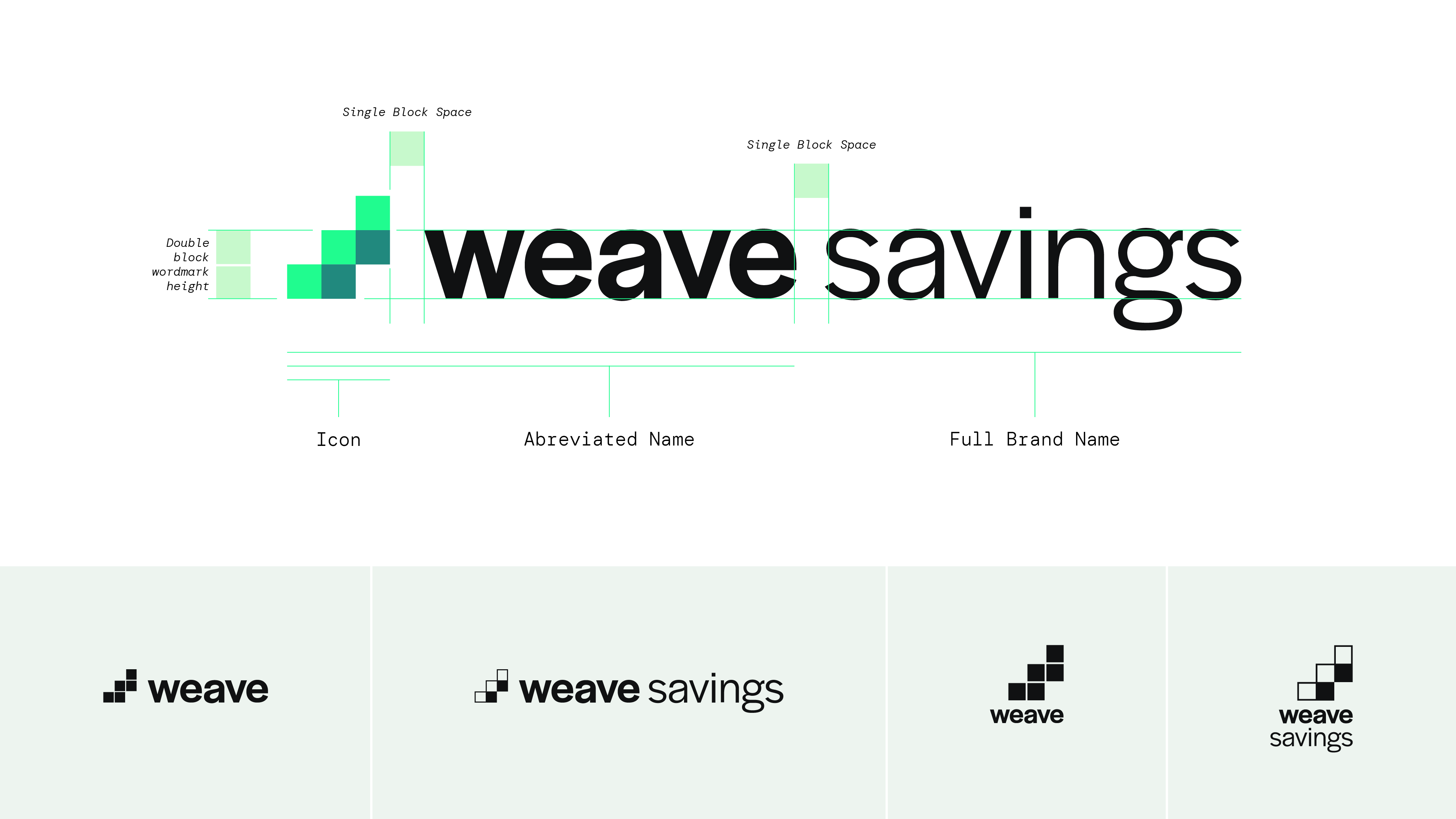
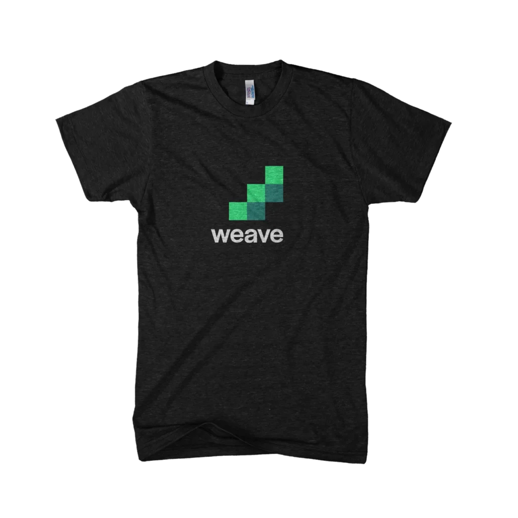
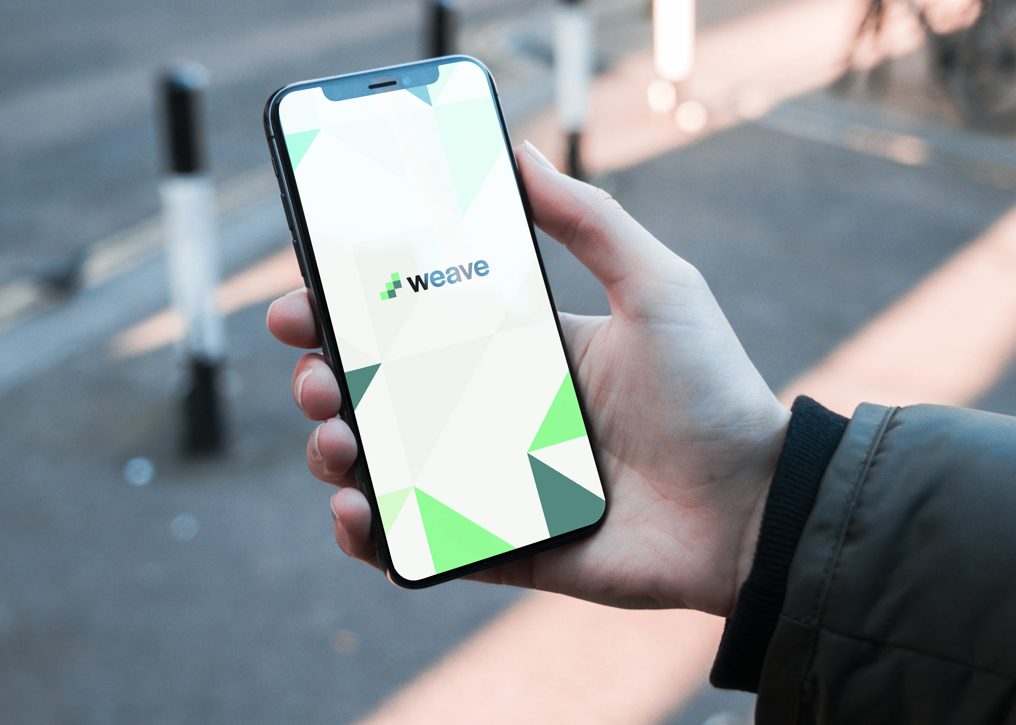
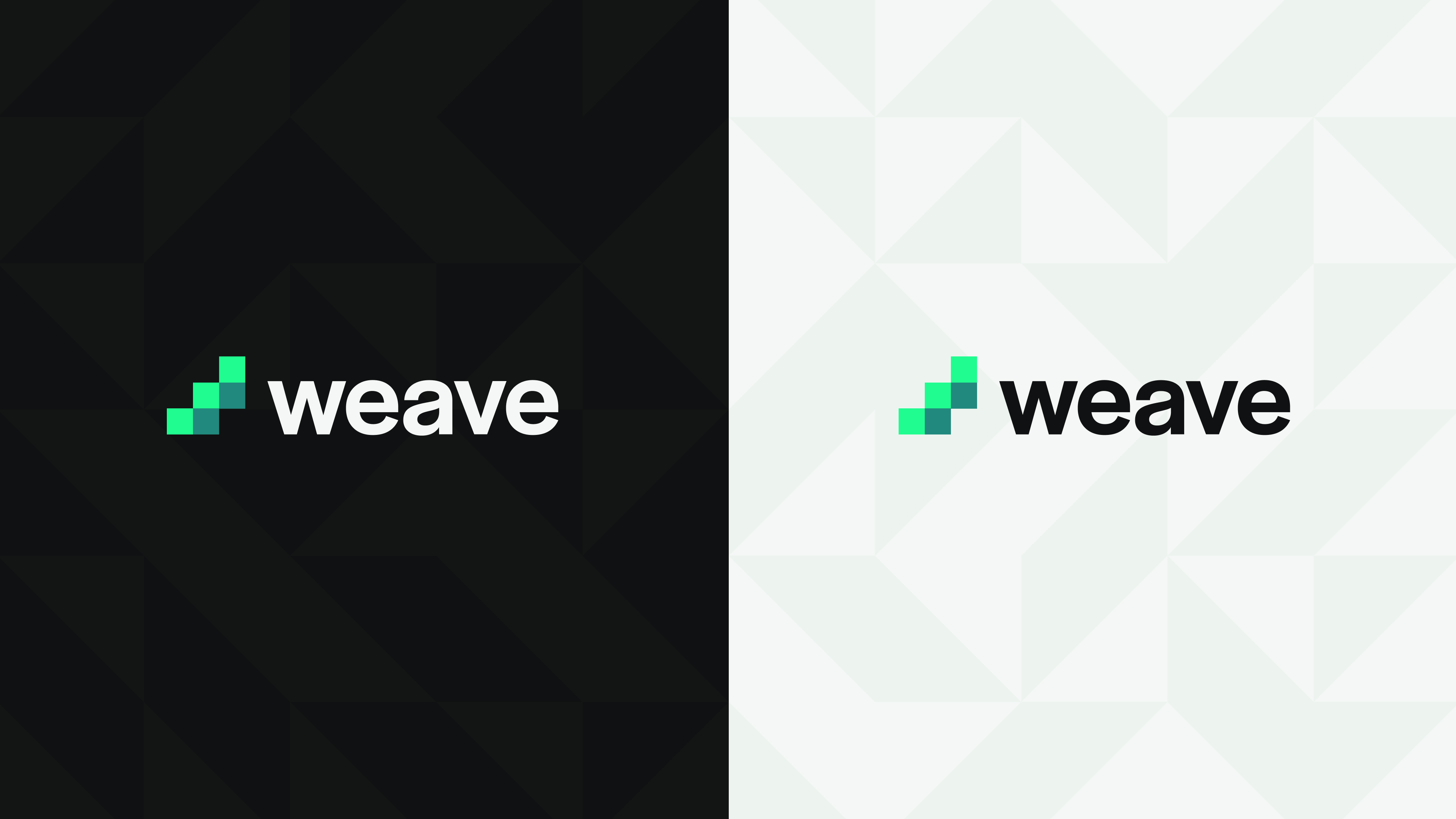
The visual identity grows from the name. The icon is a ‘w’ turned slightly to the left. The form is made of simple squares which stack to form a staircase climbing towards financial security. The three steps loosely nod to the original three locks backstory. The use of color hints at the idea of woven strands. The wordmark is set in familiar style of grotesque sans type, whose curves soften the mark’s hard right angles.

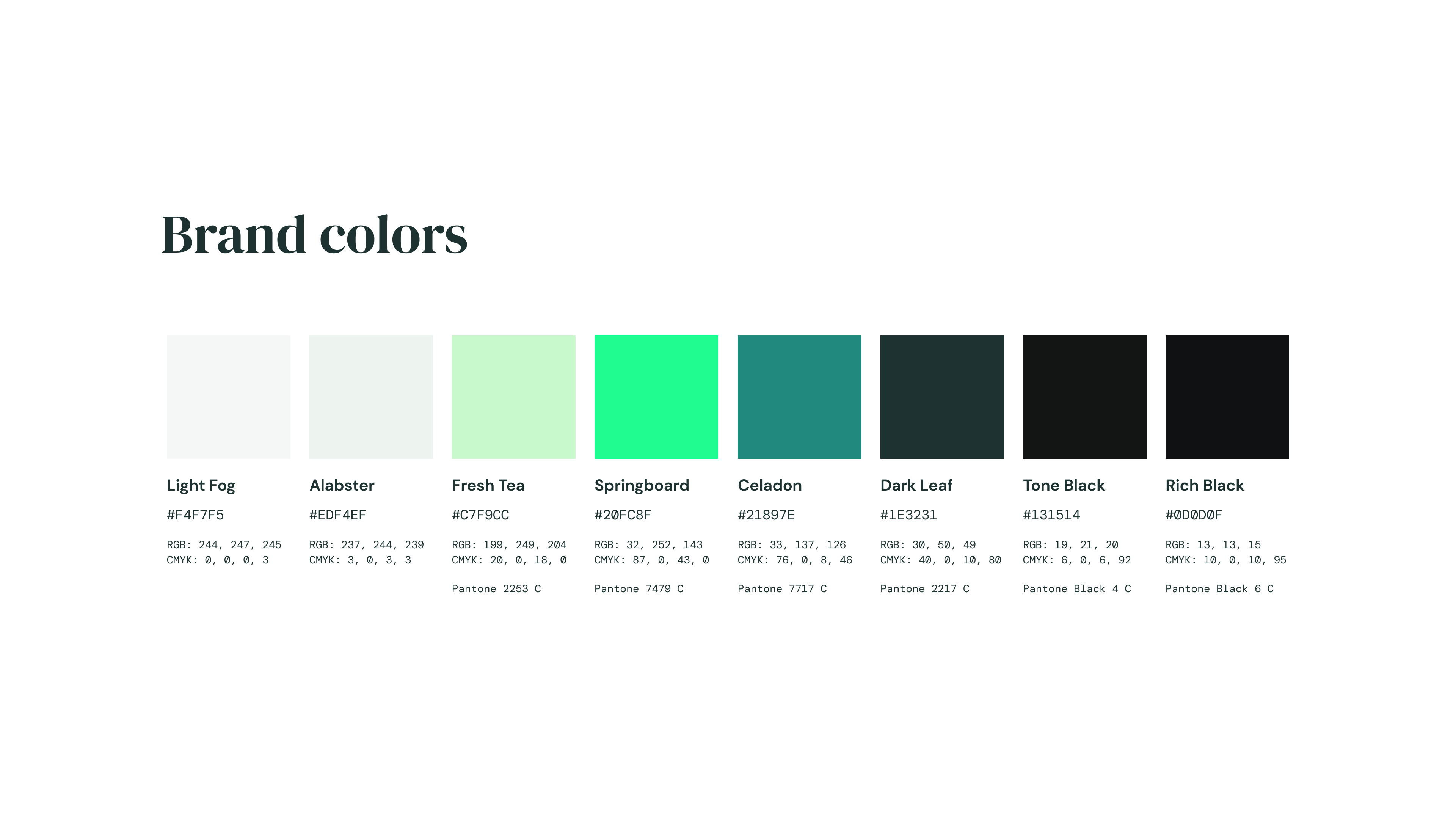
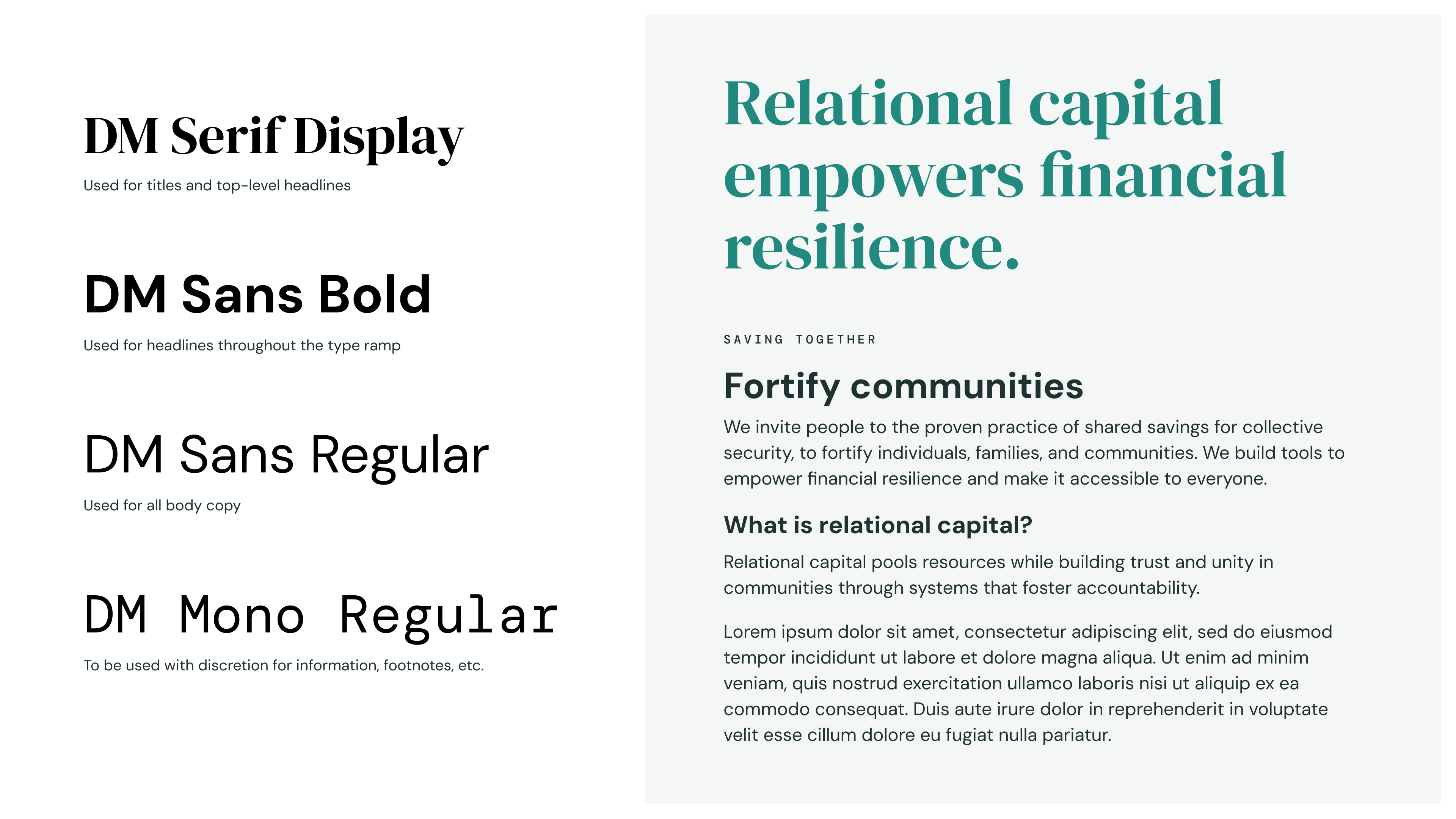
The color system is a monochromatic run of greens with a mix of energetic and more conservative swatches. The type system is built on the DM superfamily (SIL Open Font License fonts featuring sans, serif, and mono variants), so the brand can travel across web, mobile, in-app, and print without ever hitting a licensing wall. A set of geometric patterns, drawn from the logo’s own angles, doubles as windows for community photography.
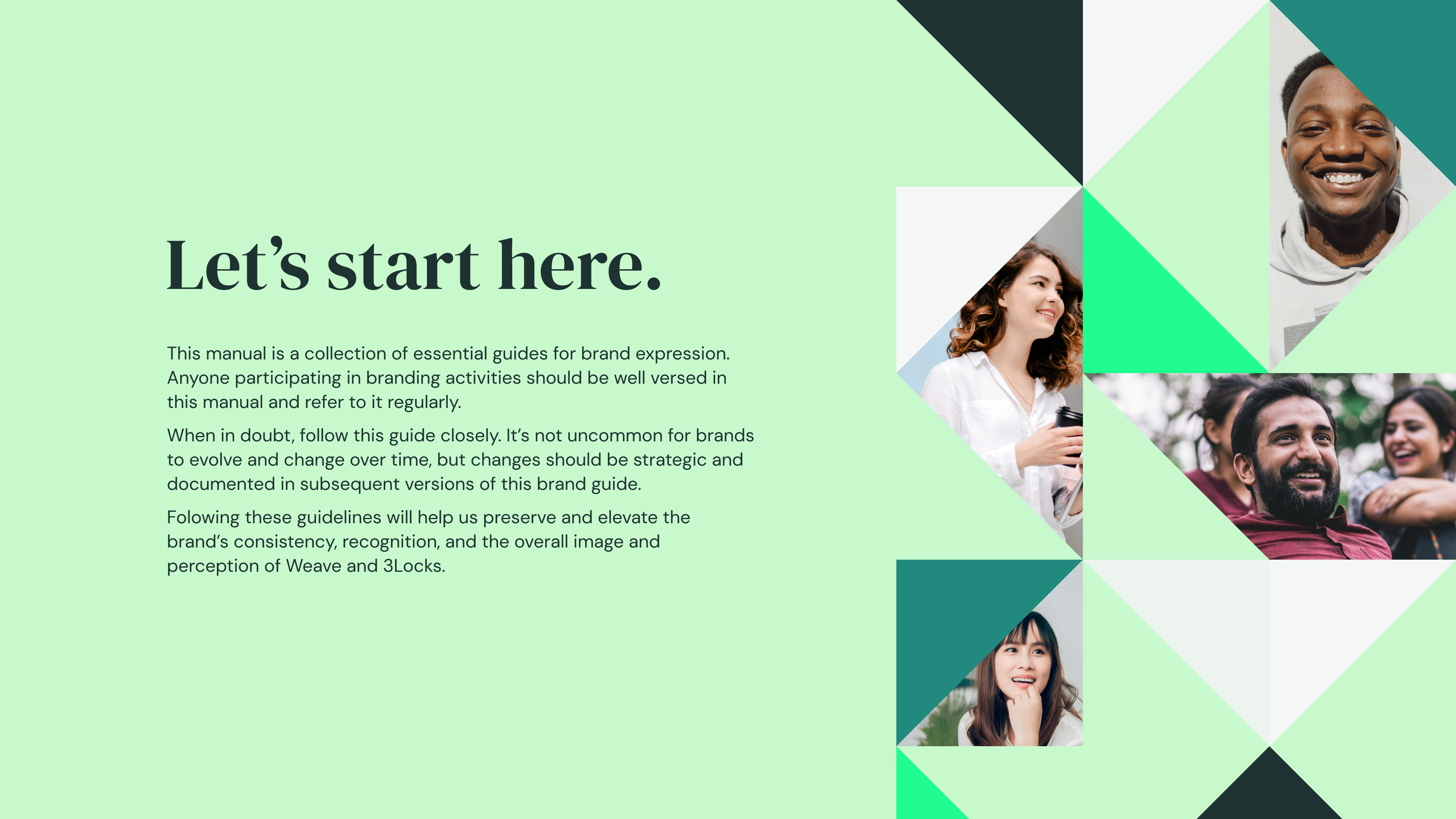
An opening page of the Weave Savings brand book, demonstrating how brand patterns can create windows for photos to come through.
A design spec displaying the logo proportions along with one-color and vertical variants.
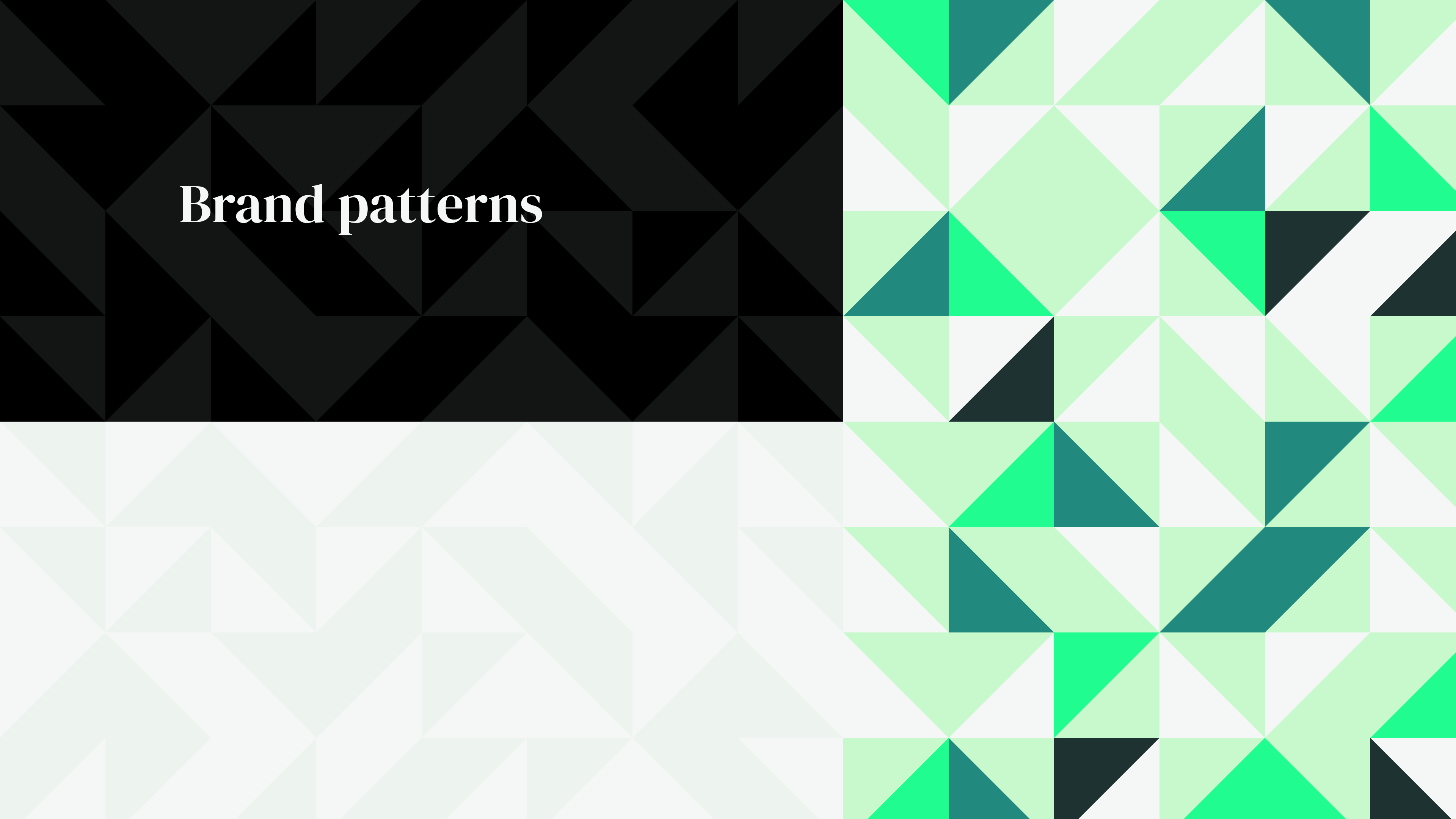
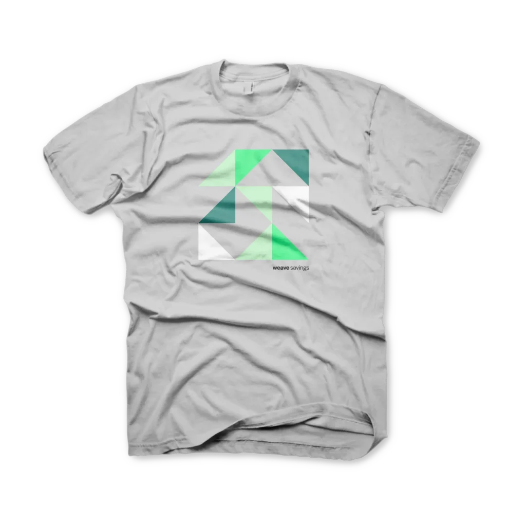
The brand patterns are made by splitting squares into triangles and playing with tone and rotation, making a sort of "patchwork quilt" pattern, a reference to another type of fabric that is strongly associated with community. Low contrast patterns in dark and light are available, as well as a bright pattern for more expressive applications.
Warm, friendly, relatable type was needed to help carry the brand's message. The DM family of fonts offer a range of styles for dynamic application while being open source and available for use on all platforms.
The color palette offers conservative tones with a bright and energetic accent.