
00%

Retail Campaign Graphics for Nike

keyboard_arrow_down

I developed a visual style for Nike Youth Apparel including image treatment and a campaign typographic mark.

Client: Nike

Agency: Tether

Sector: Apparel

Role: Concept, type design, image treatment

Challenge

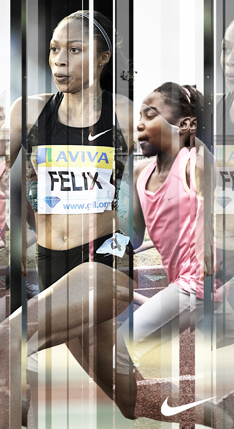
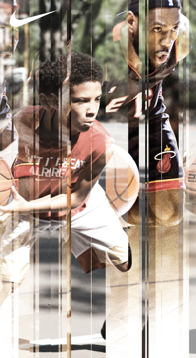
Nike needed large-format graphics for the youth sections of retail. The brief was to combine images of young athletes with images of professionals to capture the aspiration in youth sports.

Solution

Aspiring youth athletes don’t just watch professionals. They see their own potential. They’re not just comparing, they’re transforming.

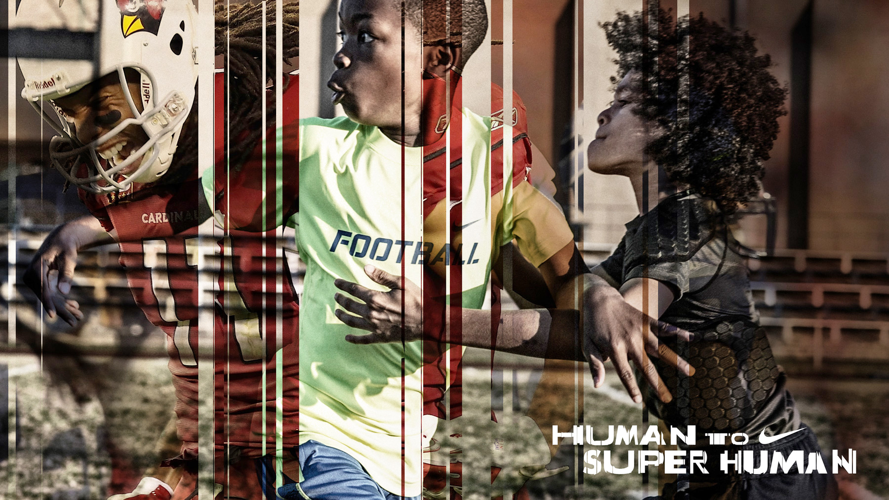
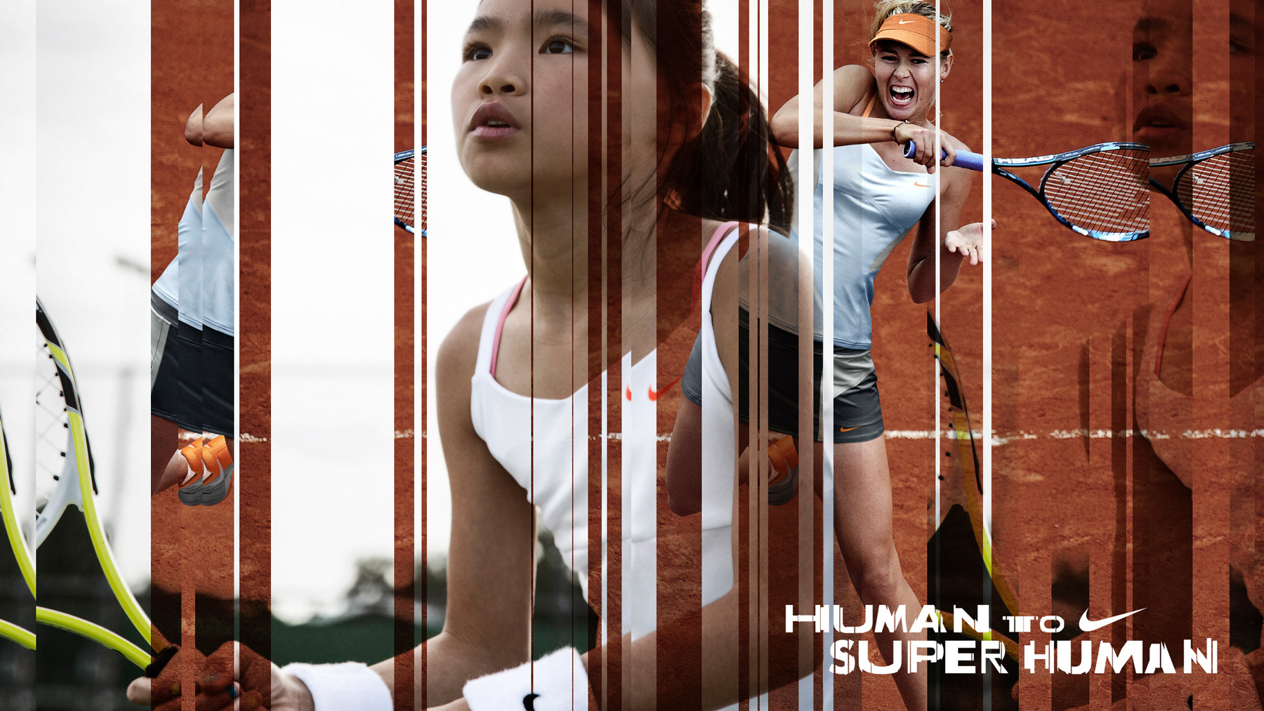
I created a treatment that mimicked putting photos through a paper shredder and reassembling them, interlacing the strips and playing with transparency to suggest the transformation from youth to professional. The rhythm of the lines and repeating elements gives the static images a new energy.

Once the image treatment was approved, Nike asked for a type treatment of the campaign line “Human to Super Human” locked up with the swoosh.

Retail graphic interlacing a professional sprinter with a young runner in vertical slats
Retail graphic interlacing a professional basketball player with a young player in vertical slats
Human to Super Human type treatment with the Nike swoosh
Conceptual type treatment which served as a campaign wordmark
Nike retail poster with vertical slats of youth athletes and the Human to Super Human lockup
Nike retail poster interlacing football athletes with the Human to Super Human lockup