WorldStrides Brand Book

keyboard_arrow_down

I worked with WorldStrides’ Executive Creative Director and Head of Global Marketing to elevate the visual brand expression and teach the new brand standards to their in-house team.

Client: WorldStrides

Sector: Travel, Education

Role: Brand guidelines, visual strategy, art direction, layout

Overview

WorldStrides is an educational travel company with an established brand. Their internal team had been revising the brand guidelines and needed help finishing key sections and exploring new ways to express the brand visually.

I created new sections of the brand book, expanded the graphic system with new patterns, shapes, and iconography, reworked the typographic systems, built libraries, and set the standards for photography and motion.
Result

A comprehensive 93 page brand book including detailed guidelines and a collection of examples of design execution. Ultimately, an in-house team of designers equiped and ready to carry out the guidelines.

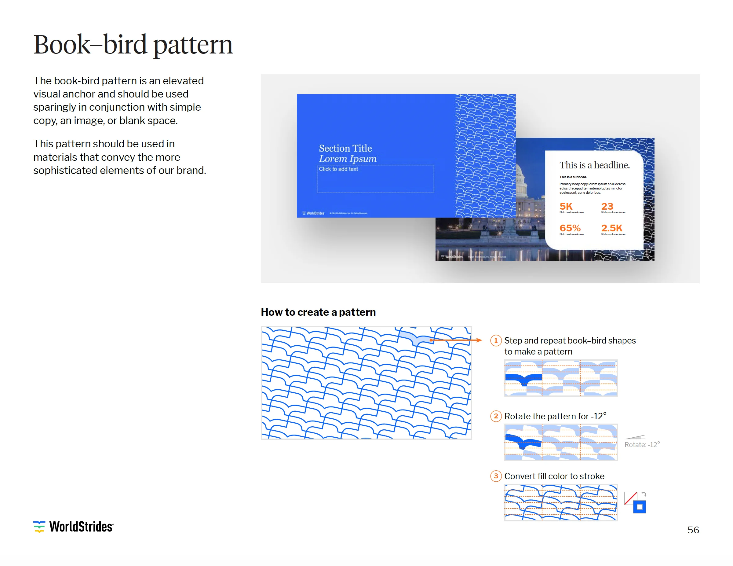
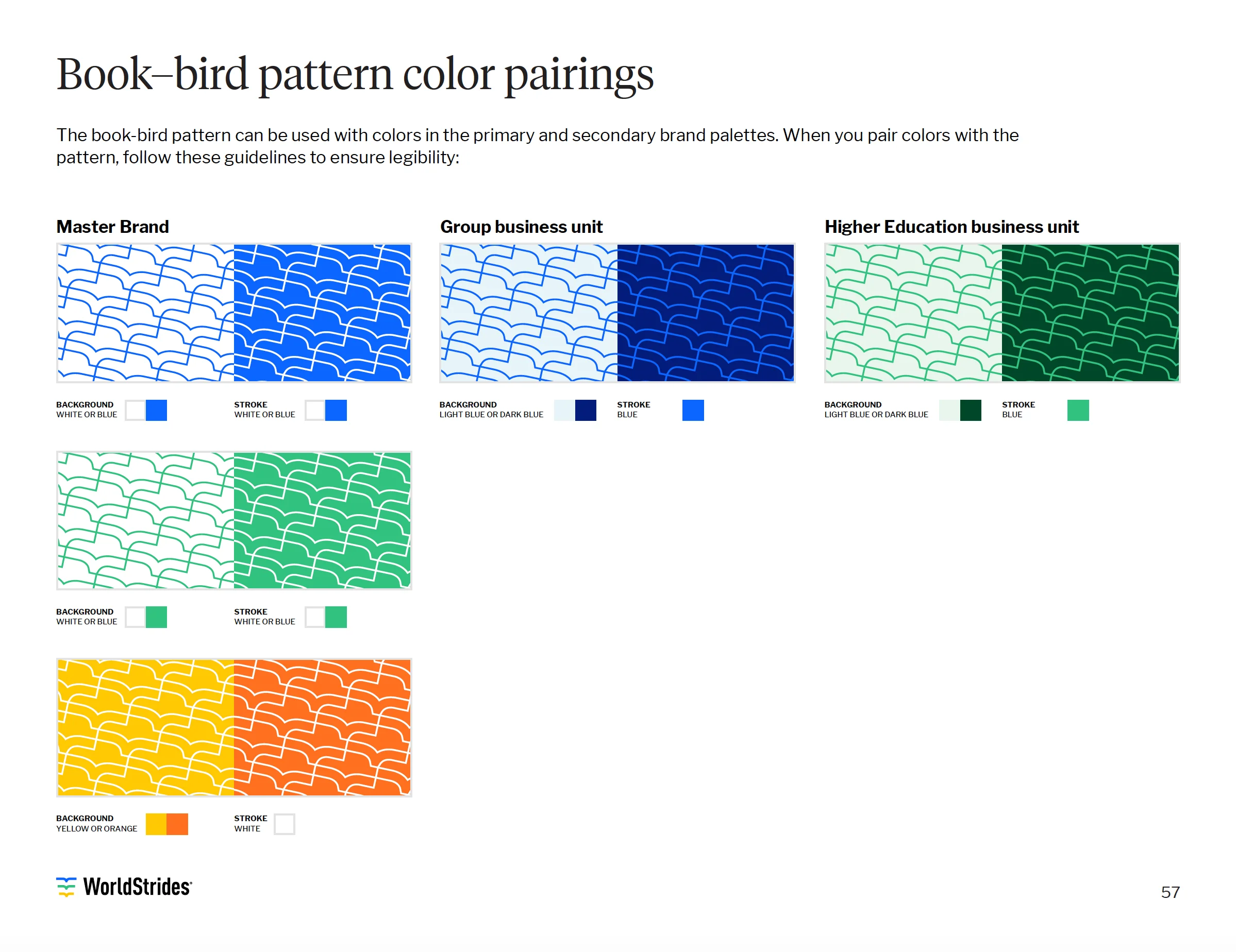
Brand new patterns and refined shapes

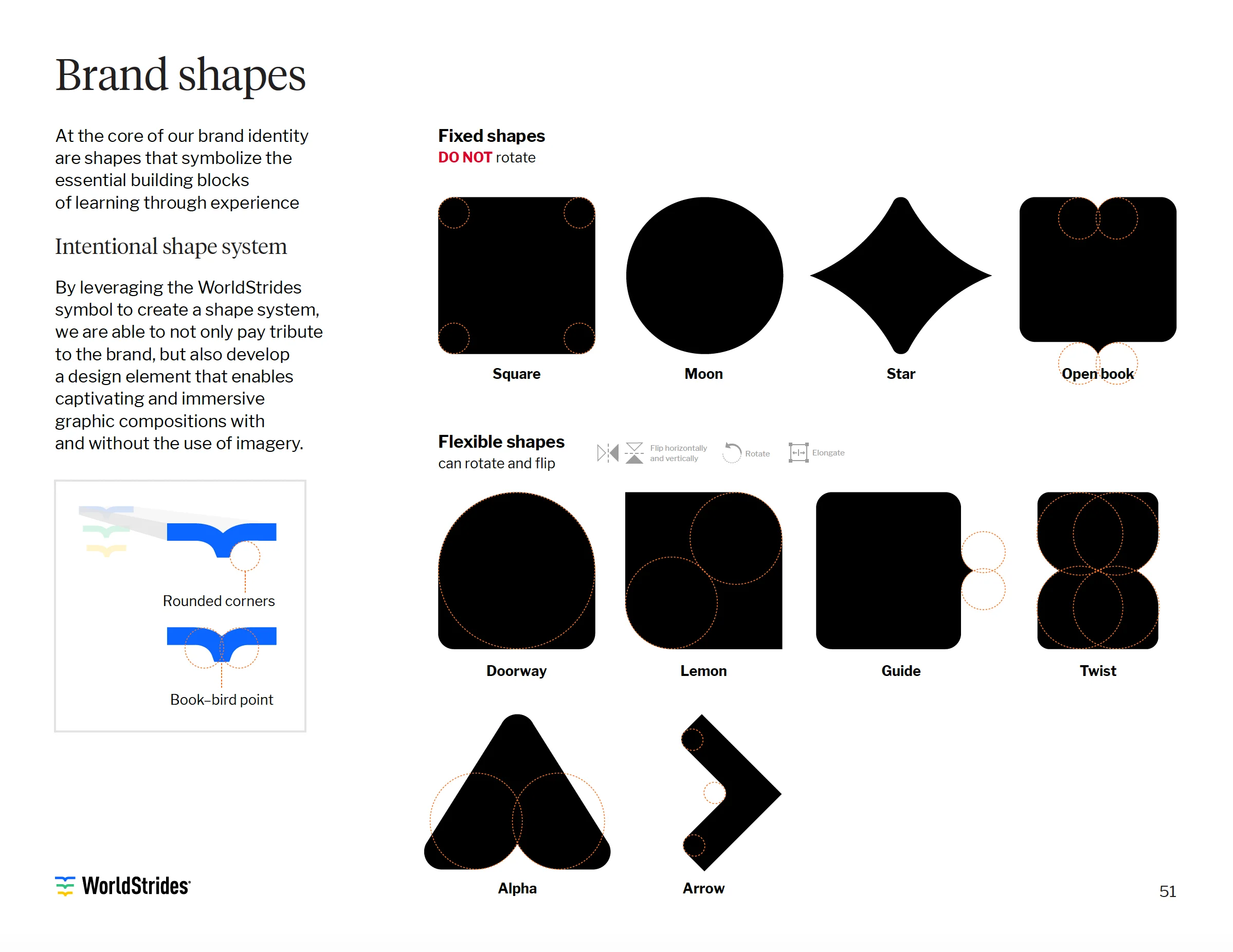
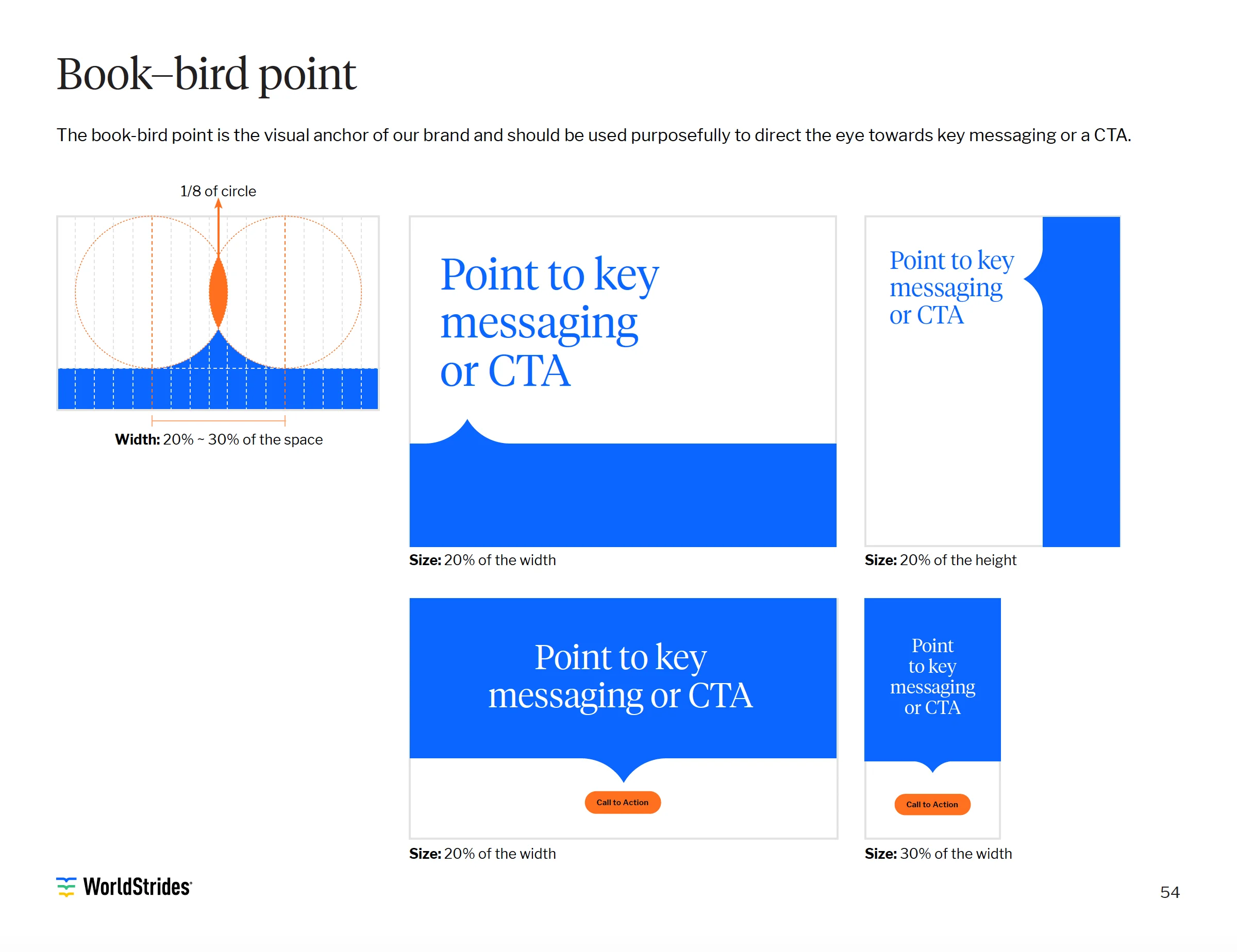
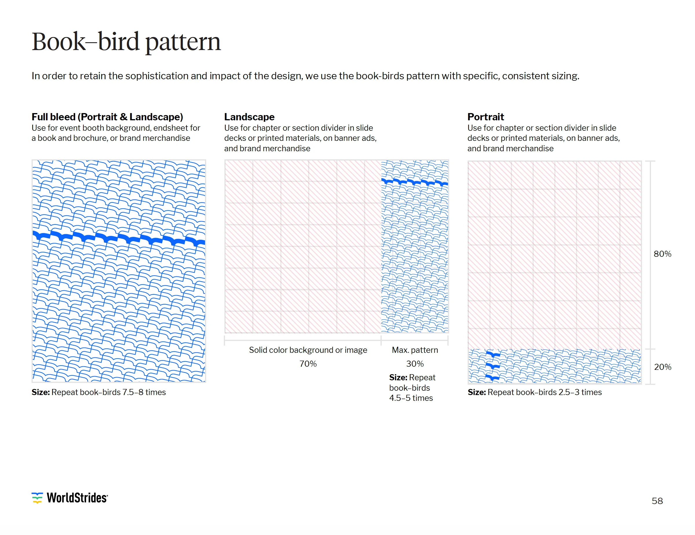
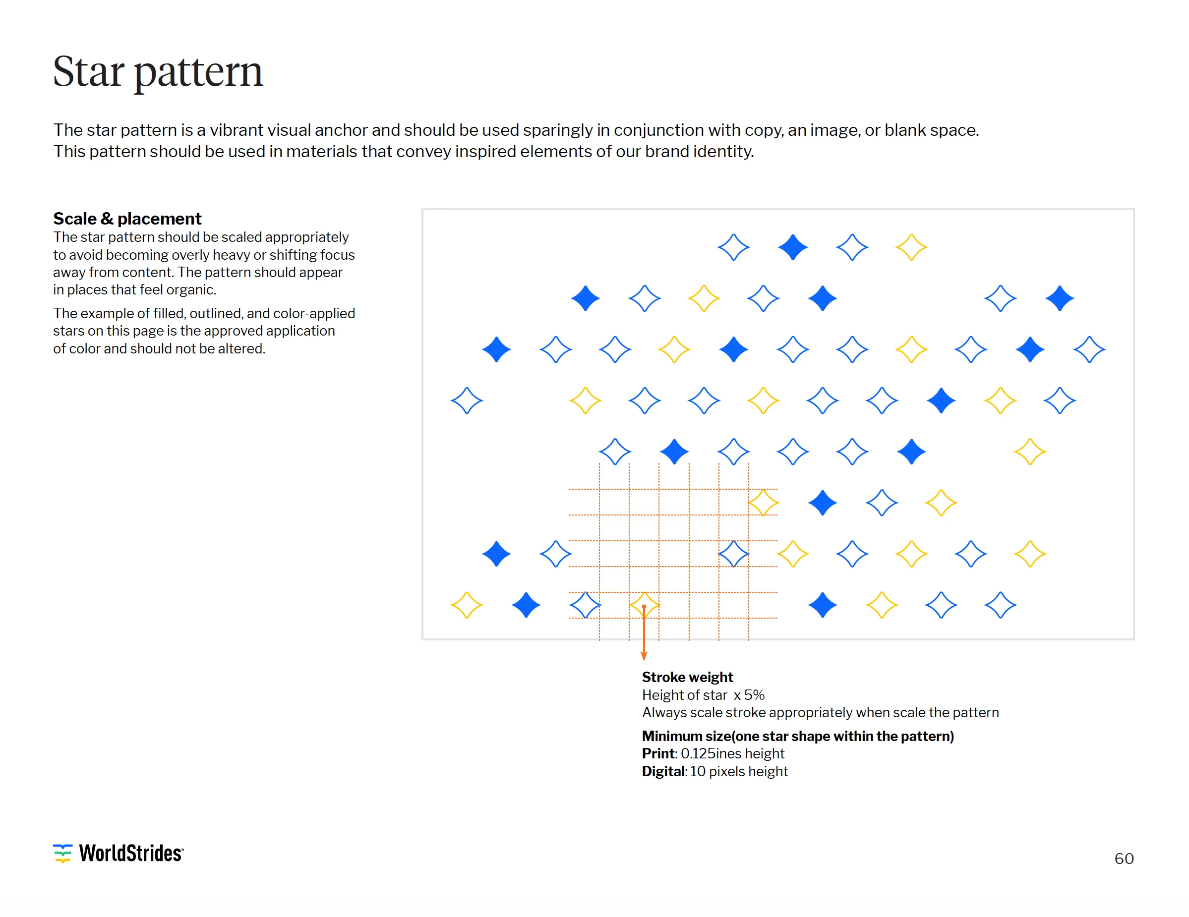
WorldStrides’ in-house team had begun to use shapes for layout, but the shapes were collected over time and not made to relate to each other. I worked to find the commonality between them, refine the forms, and define clear guidelines for how to use them.

I had been asked to also create patterns that could be used to add more graphic tools for the design system. Below are some of the final pages from the brand book that relate to the patterns and shapes.

A more appropriate typography

The team had been using Tiempos Text for headlines and titles, but using weights inconsistently. They were using a mix of uprights and italics, which was a nice way to add some personality. All body copy was set in DIN, a typeface with many more weights and widths than they needed, and a font without the kind of personality that their ‘Tiempos’ font demanded.

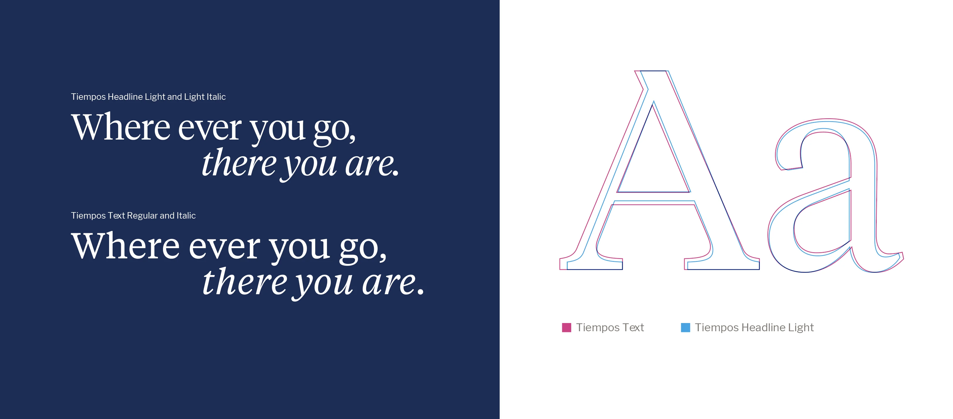
I proposed the implementation of the ‘Tiempos Headline’ light and light italic weights. The headline version of the Tiempos font was a subtle shift that didn’t require uprooting the entire brand. It’s more appropriate for headlines as it was specifically crafted for that purpose.

Type comparison spread testing the Tiempos headline typeface, with a sample line set two ways and a large Aa

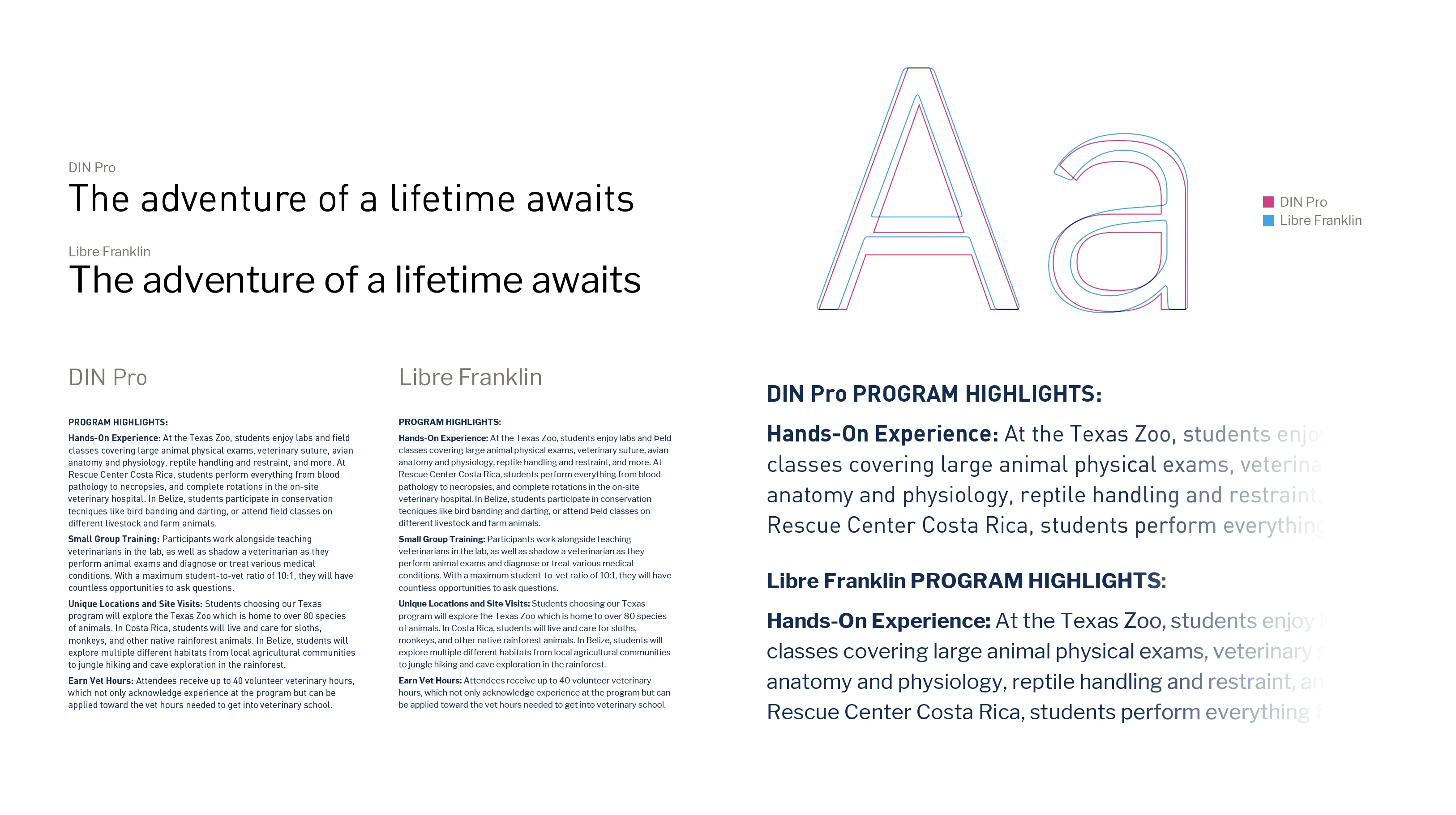
To deal with the challenges of DIN, I suggested the use of Libre Franklin, a font with a more human feel. Libre Franklin solved the other concerns as well as eliminated the need for an alternate body copy font. The following image was presented to show the differences in headings and blocks of copy.

Type comparison of DIN and Libre Franklin, with a sample line set two ways and a large Aa

The Type Ramp

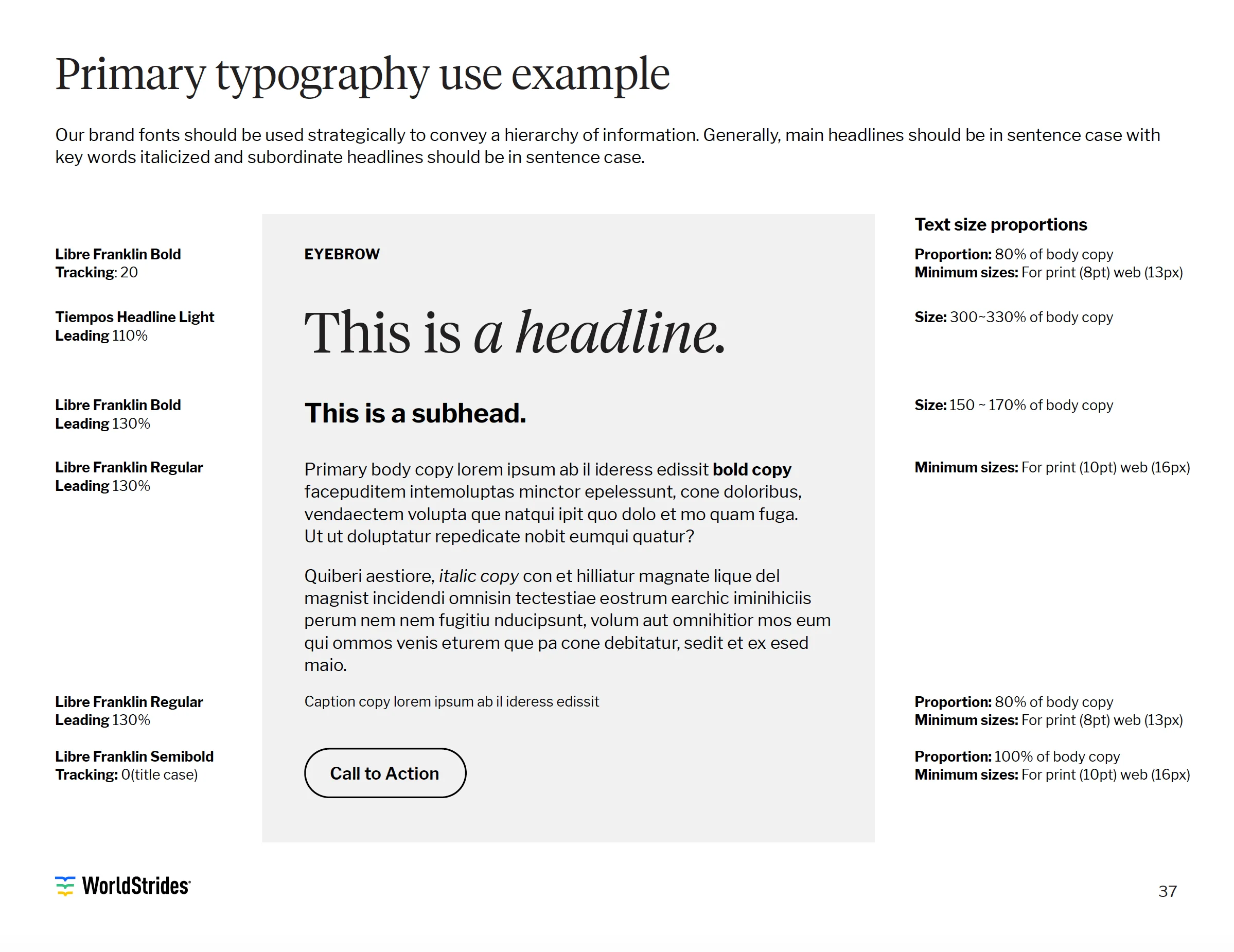
Below is a look at the page from the final brand book. This shows a comprehensive look at how Tiempos Headline and Libre Franklin should be used.

Typography usage spread showing the type hierarchy with headline, subhead, and body settings

Applying the brand system

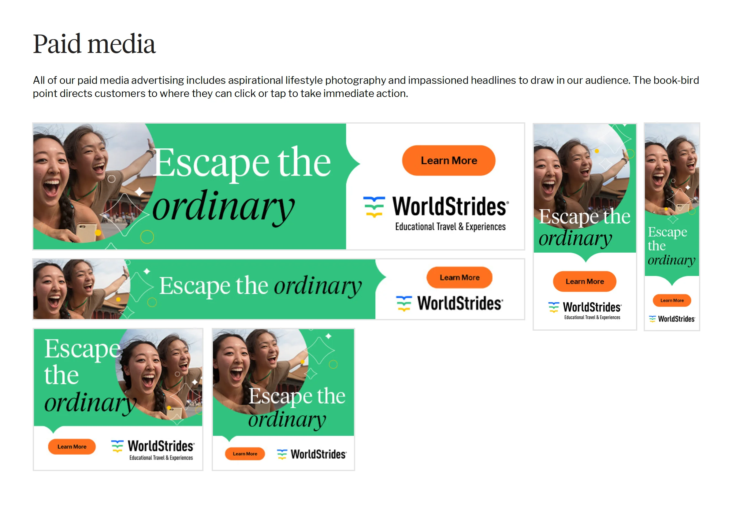
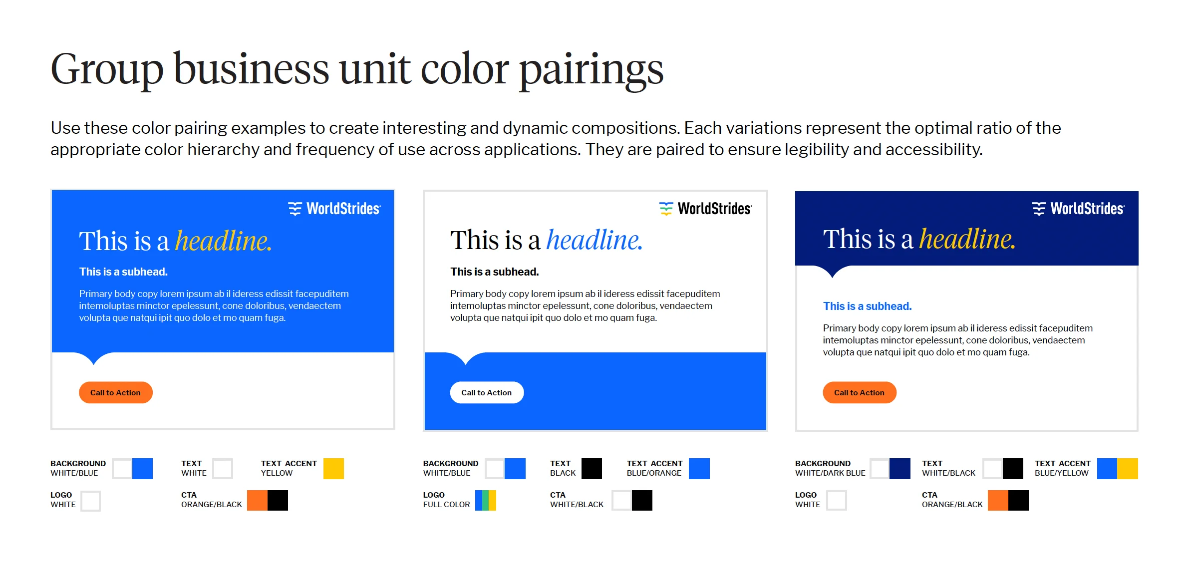
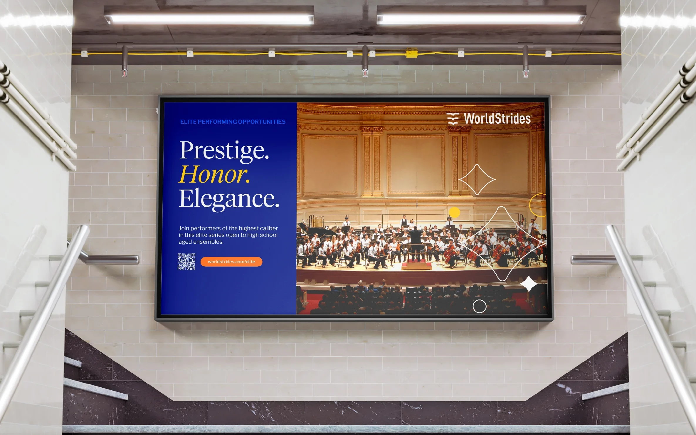
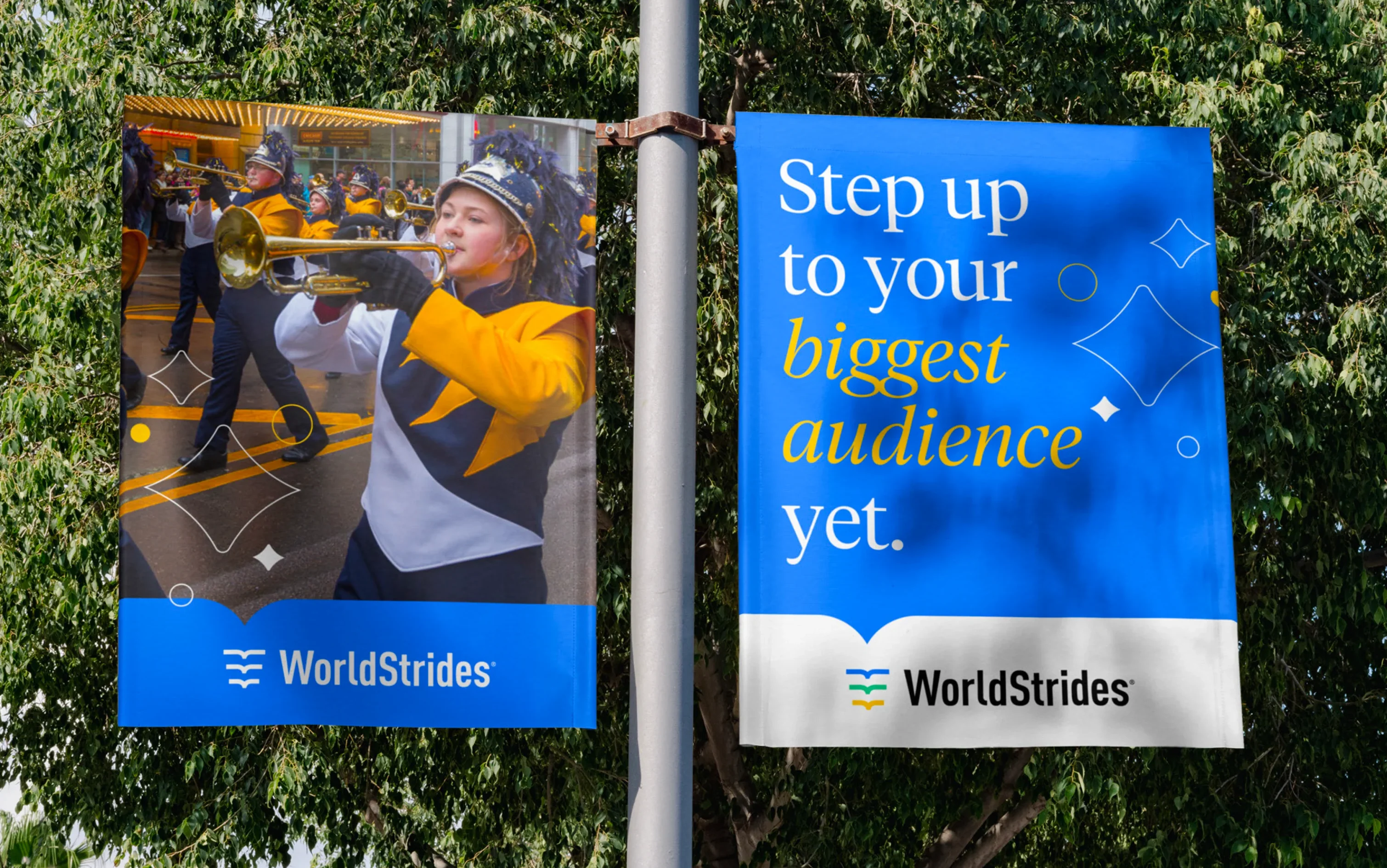
Once the additional elements were in place, I worked to create examples for layout in digital and print applications. The following examples are designs created by myself and by the in-house design team, using the guidelines I was scoped to make.

Paid media spread with WorldStrides ad examples reading Escape the Ordinary
Spread showing headline layout guidelines with business-unit color pairings

Additional Credits:

Creative direction by Paul Kidd, additional design from the WorldStrides internal design team