Me to WE Package Design
- Packaging Print
Client: Me to We
Agency: Tether
Sector: Social Impact
Role: Structural design, die-line development, lettering, graphic design, Brand Standards
Challenge
Our team had just finished rebranding Me to We, We Day, and Free the Children, and the Rafiki Friend Chain was one of many items that needed attention. The chain is a $10 strand of glass beads, handmade in Kenya. Each purchase funds a specific impact in a developing country, providing access to education, clean water, medicine, food security, and so on.
Me to We needed a new package design in part because a deal had been struck to sell the Friend Chains in Nordstrom. The brand also needed the packaging to serve as a working example for its internal design team, showing how the new guidelines could extend into expressive, product-level design.
Insight
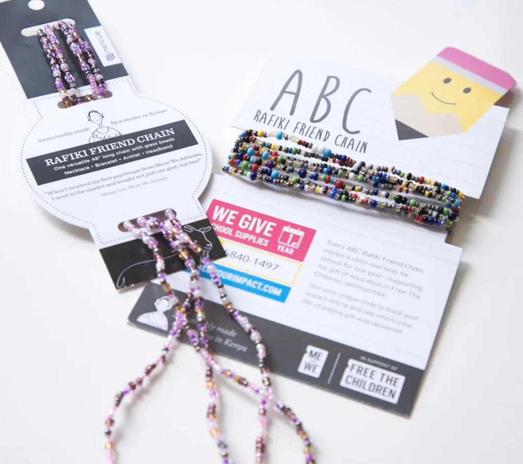
I had been asked to re-skin the existing packaging, but noticed issues worth addressing. The existing form was flimsy and cheap, and our own samples arrived messy and tangled—evidence that stock shipped to retailers would be even more unwieldy. A visit to Nordstrom made it clear a re-skin wasn’t going to be enough. The Friend Chains looked like handicrafts from summer camp next to the accessories at Nordstrom. I knew the right package could earn them a place at this tier of retail.
I pitched a re-scope: a new form that could raise the product to that standard while keeping the benefits of the current package form, including being low cost, easy to assemble, and easy to ship.
Solution
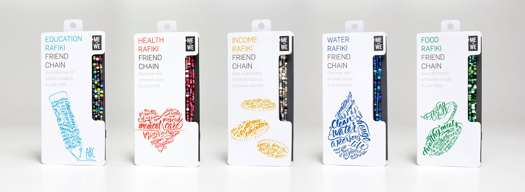
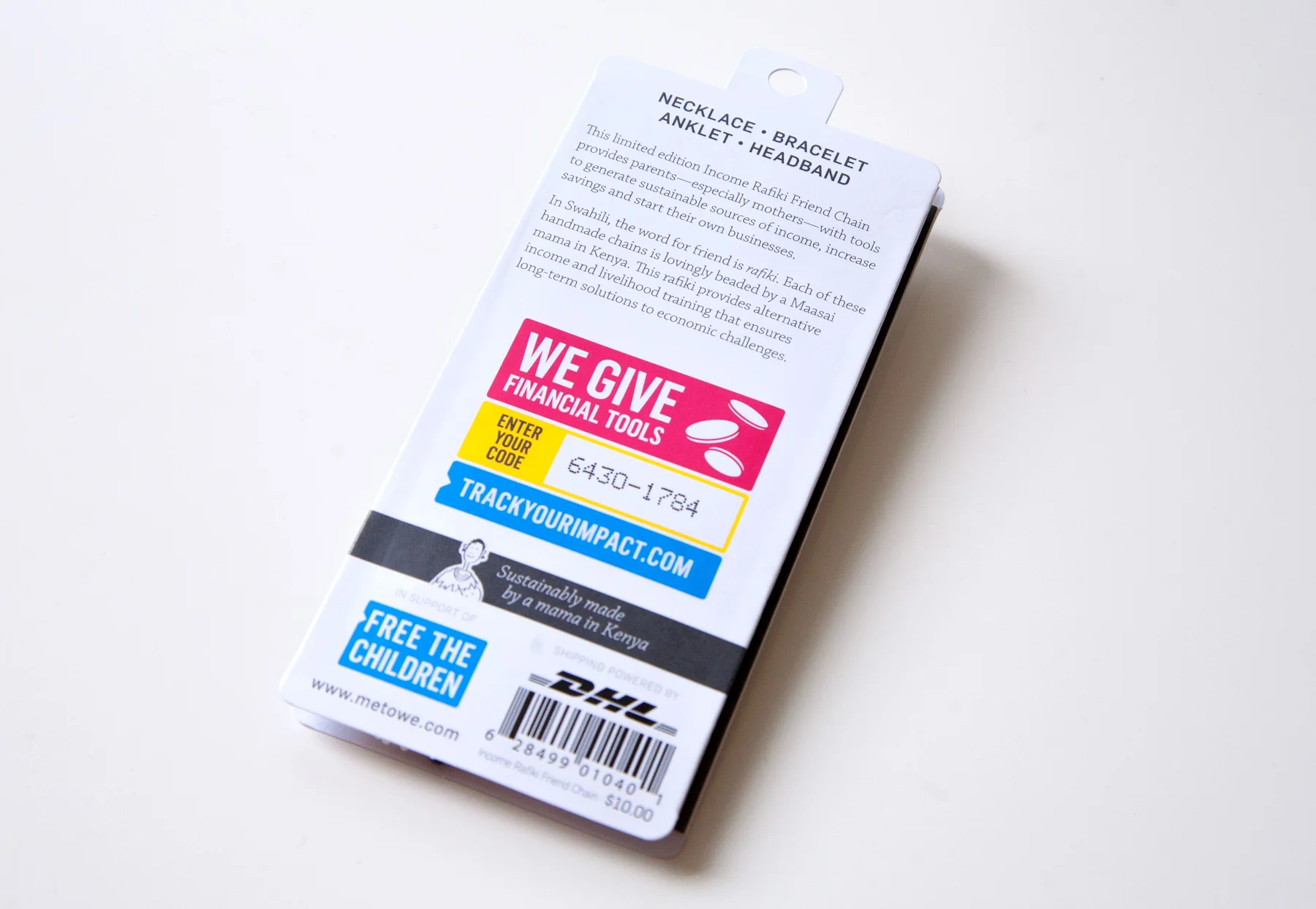
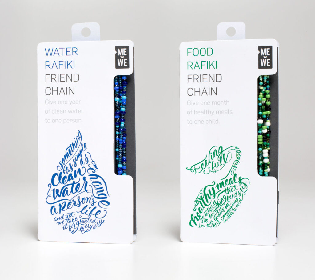
I worked to develop a form which I can best describe as a sort of paper spool. It’s sized to allow the Rafiki Friend Chain to be wrapped times around it by doubling it twice, with enough tension to hold it neatly in place. The front serves as a large billboard-like surface for messaging about the product’s specific impact along with ample space for branding. The form also features a cutout that allows the customer to see and touch the product as well as easily remove it, try it on, and easily return it to its place.
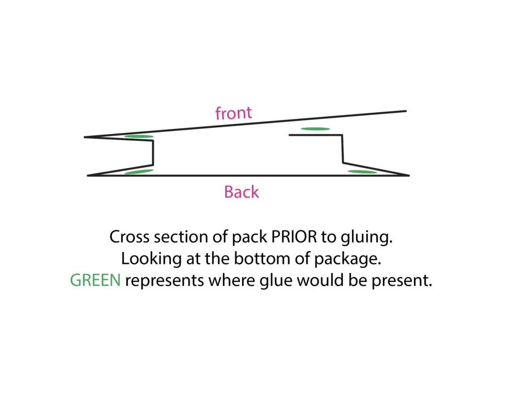
The Friend Chains are hand-made in Kenya, and the “mamas” who make them load them onto the package. Shipping flat was a strength of the previous form, and the new one had to keep it. The paper spool prints, glues, and packs flat, taking on its carton-like dimension only once the chains are wound into place. Loaded, the products packed into shipping boxes like uniform blocks, no stray loops to tangle and almost no wasted space.
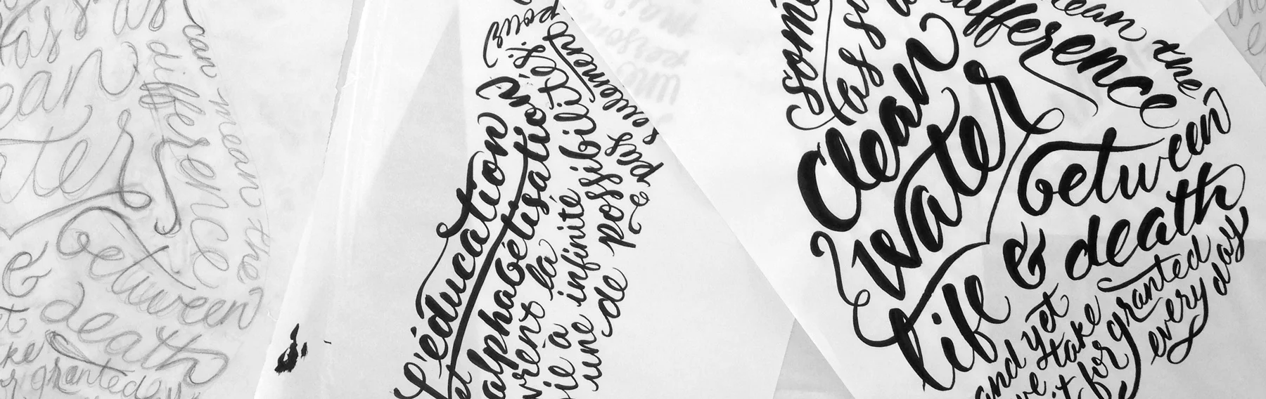
For the graphics, I defined clear space for product name, description, and brand blocking, and left an open canvas for more expressive elements. I used hand-lettering, a style the internal team already worked in, and set each chain’s message into a shape tied to its impact. Education, water, health, and food security each got their own lettered form. It was a working example of how the new brand system, restrained by the design structure, could carry expressive product-level work.
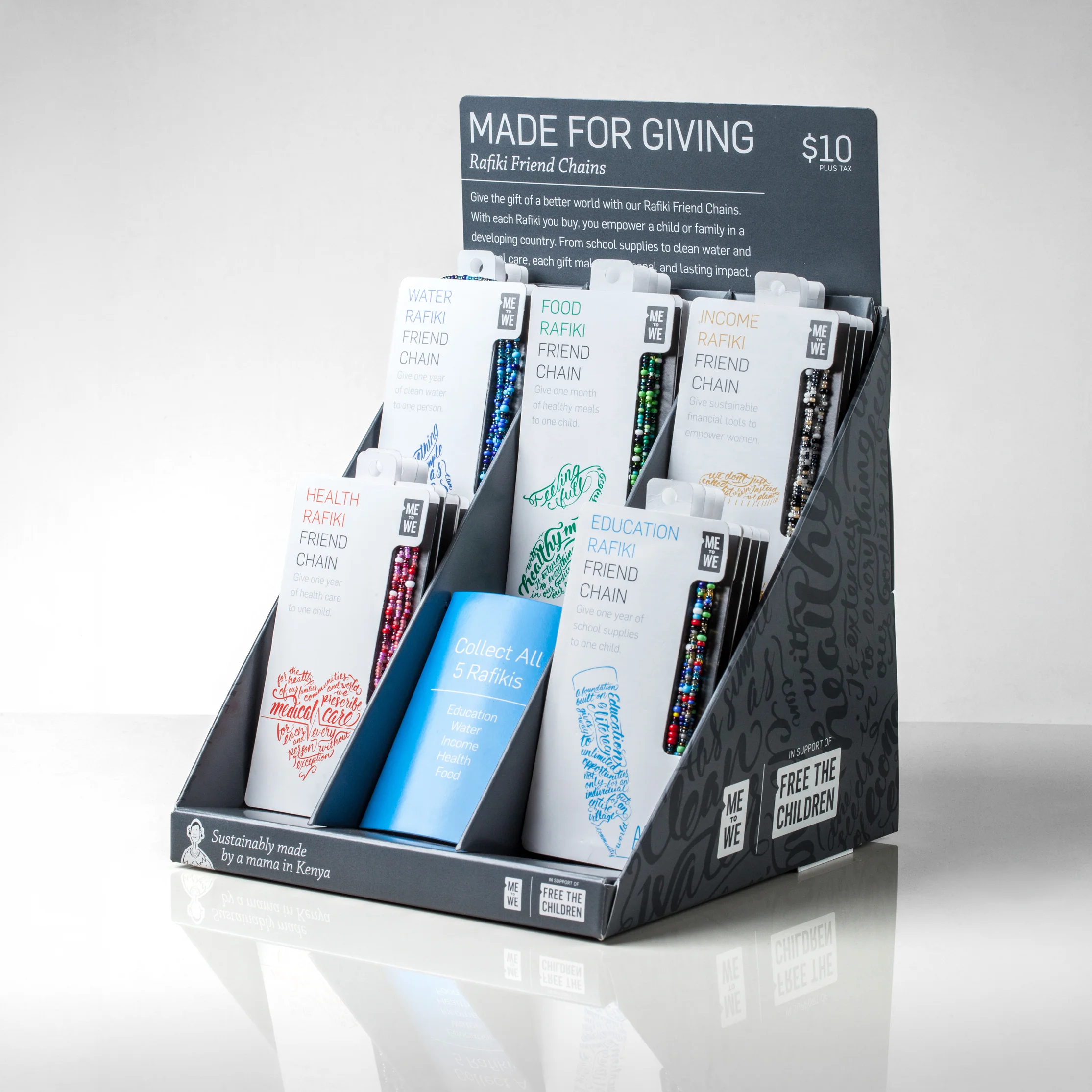
I also designed the countertop display die-line and corresponding graphics, so the product arrived with its own way to stand on a Nordstrom counter.
Result
The package was immediately successful and has stood the test of time. The team in Kenya reported that loading the chains onto the new spools was easier than the prior packaging. A Nordstrom VP who had helped bring the product in told the client he’d never seen an item like it sell out so fast, and that the compact counter display did the work with almost no floor space. The retailer was proud to sell it.
It’s been over a decade since I redesigned this package, and the spool form is still in production. The graphics have been redesigned many times over yet the structure hasn’t changed. The engineering outlived every look that’s ever been printed on it.
Developing the form
Once we’d agreed that we should revisit the form of the package, I began playing with shapes and forms, looking for ideas that allowed for less tangled mess and a more elevated presentation. I quickly landed on this basic spool-like design. The shape came quickly, with proportions similar to the new Me to We logo.
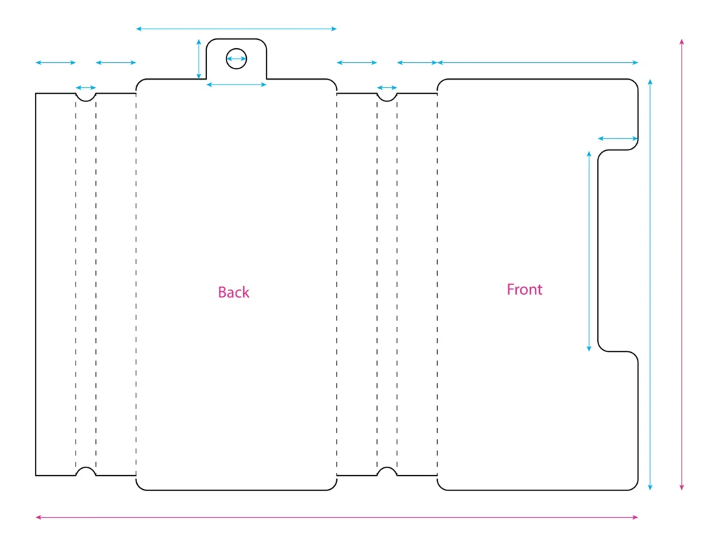
I communicated directly with the printer to understand the limits of page size and the breakpoints that kept costs down. I knew a custom die would have to be made and adhesive applied.
Once I had a form that I thought might work, I drafted the die line in Adobe Illustrator and created a complete spec for the printer. I expected that the packaging engineers from the facility that was going to produce the packaging would come back with improvements or refinements that would help the package function as intended. They did their own testing and my dieline was ready to go into production, saving the client the costs associated with such adjustments.
Designing the graphics
The new brand system was built to be clean and consistent, with tight type, strict blocking, plenty of white space. That restraint was deliberate, but left on its own it makes for a cold and clinical execution. We’d intentionally built the system so that Me to We’s in-house designers, or students, or outside artists could fill a large dedicated area like a blank canvas. This device gave the team clear rules and the flexibility to streatch out and play with the space. This gave the package its much needed warmth and personality.
I filled the space on this first run with hand-lettering, a style favored by the inhouse team. That choice was strategic as much as visual: anything I set up here, they could carry forward without the agency hover over their shoulders. Every impact got its own lettered form, so the system held together while each variety still felt particular. That was the working example the brand had asked for: a locked structure that kept things consistent, and an expressive layer any designer on their team could pick up and run with.
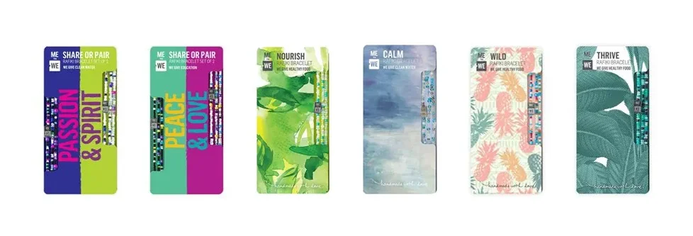
The elements of the design all came together in the countertop display stand. I had worked to create a foldable display that demonstrated the full set of Rafiki Friend Chains. This stand shows off the mix of graphic elements that are core to the brand as well as the warmer hand-made graphics.
Before and after
Credits:
Structural design, die-line development, lettering, graphic design by Evan MacDonald
Writing by Allison Roger
Design direction by Troy Nebeker
Project management by Kim Lovitt
Rafiki Friend Chains hand made by Me to We Artisans in Kenya